Jupiter
The Brief
Jupiter wasn’t just another dev studio launch. It was an intentional move to create something different — a new kind of partner for designers and brand-led founders. One that doesn’t just build but brings care, creativity, and calibration to the table. We were tasked with crafting the brand from the ground up — from positioning to presence — with a tone that felt quietly confident and culturally in-tune.
The Insight
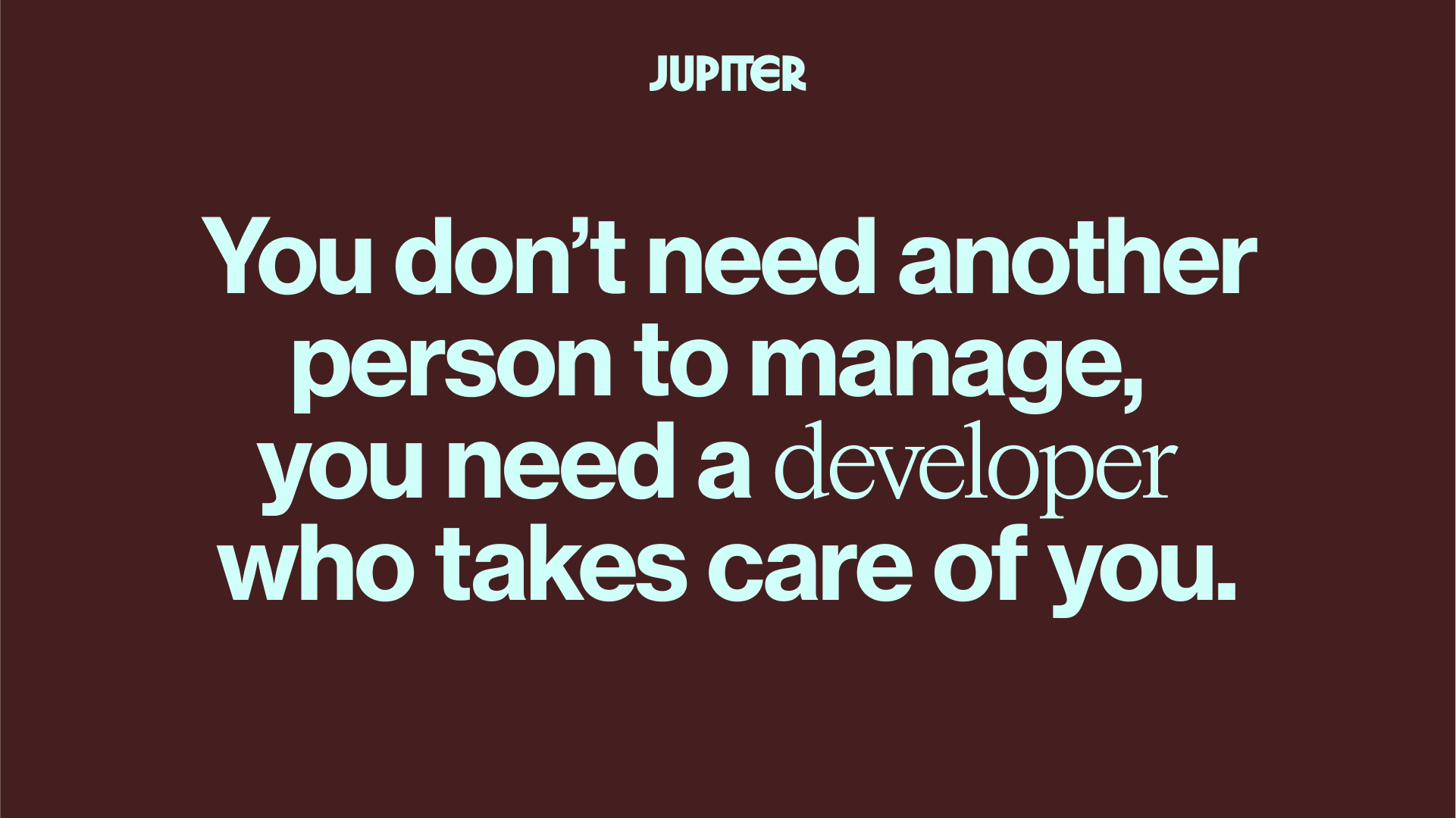
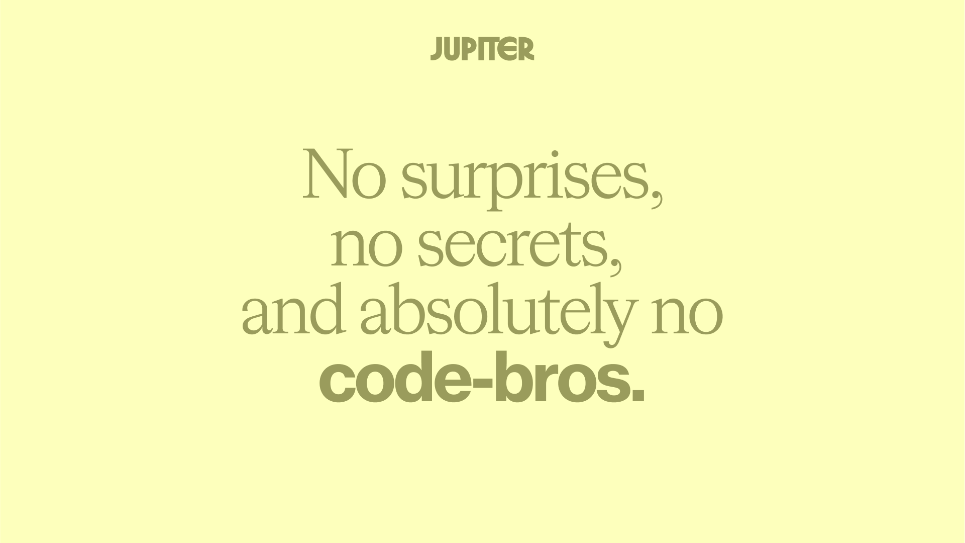
In a sea of cold code and clunky handoffs, Jupiter set out to embody the hospitality of development. Thoughtful. Respectful. Made to elevate good design. We leaned into this ethos and designed a brand that felt like a creative co-pilot — structured enough to inspire trust, soft enough to invite collaboration.
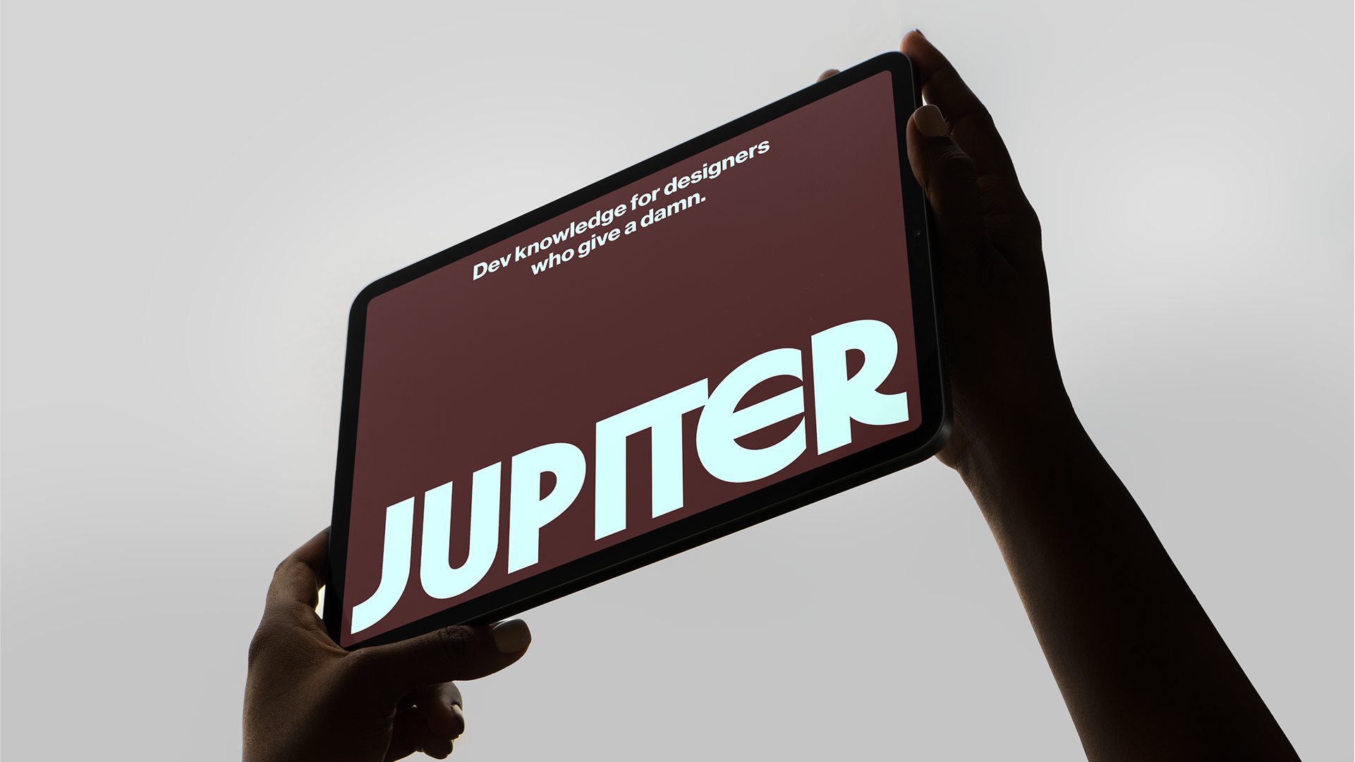
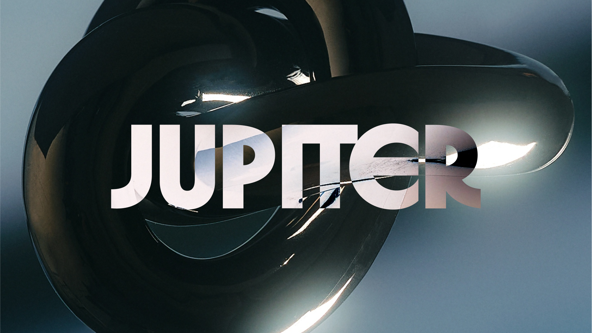
The Aesthetic
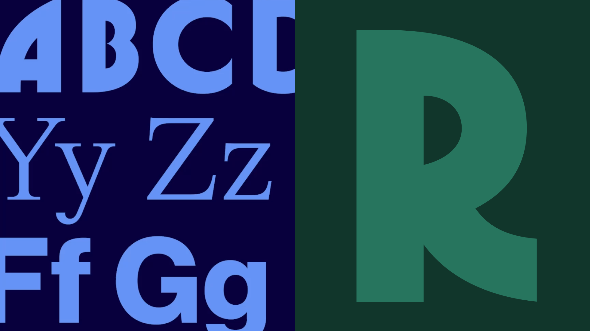
We channeled the quiet cool of ’90s editorial — minimal, elegant, and effortless. A tight type system. Understated color cues. Functional layouts with a fashion-forward edge. It’s development, dressed with taste. Designed to support creativity, not overshadow it.

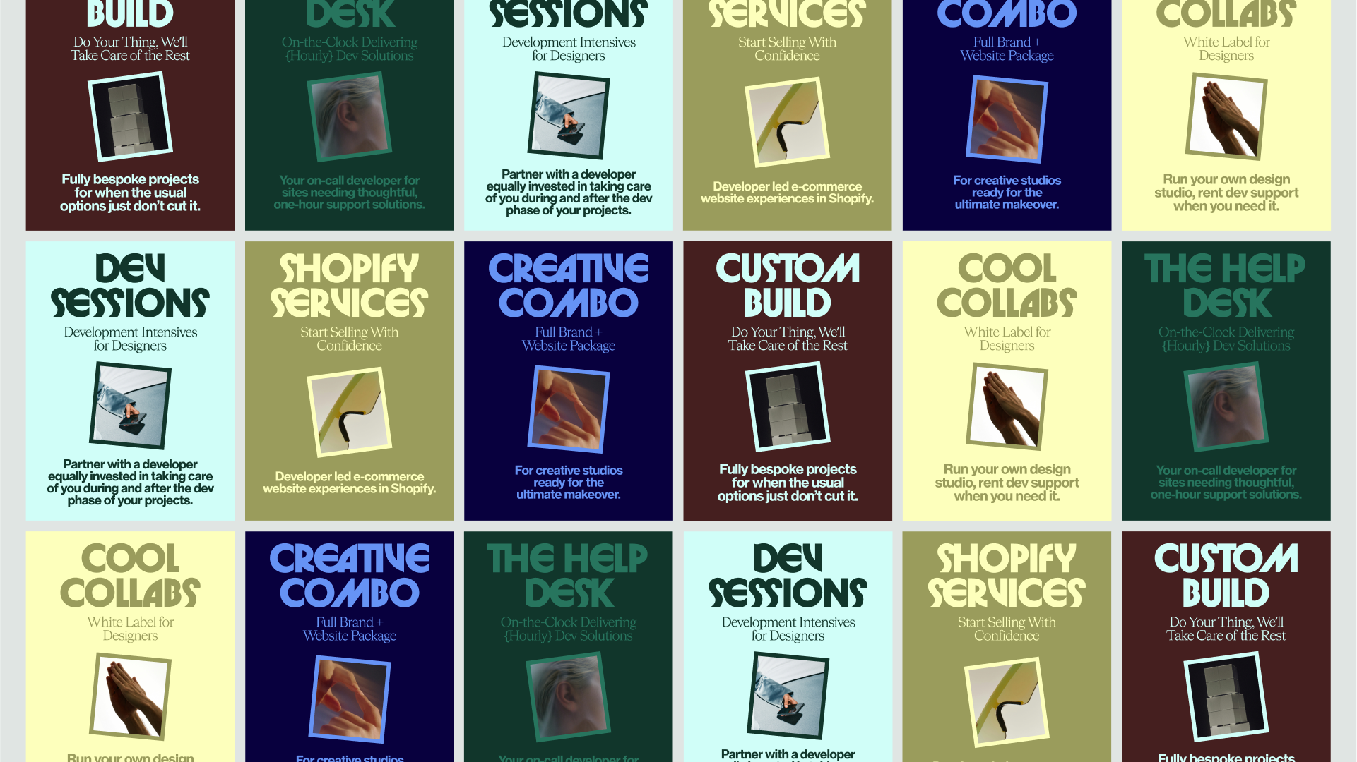
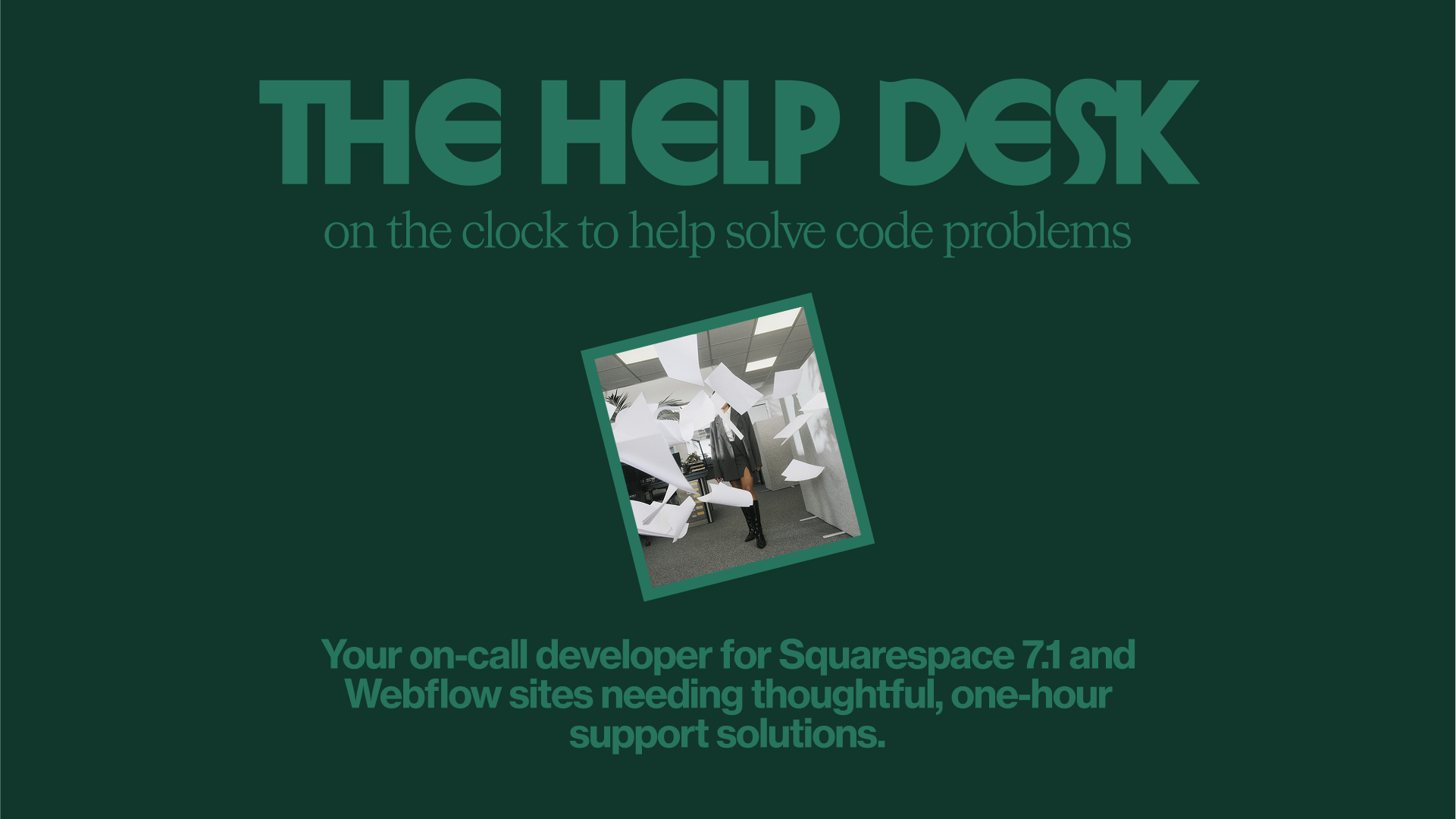
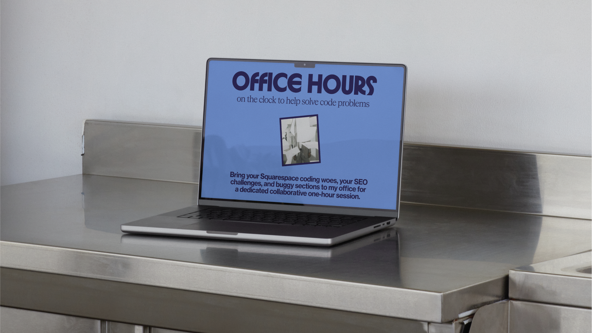
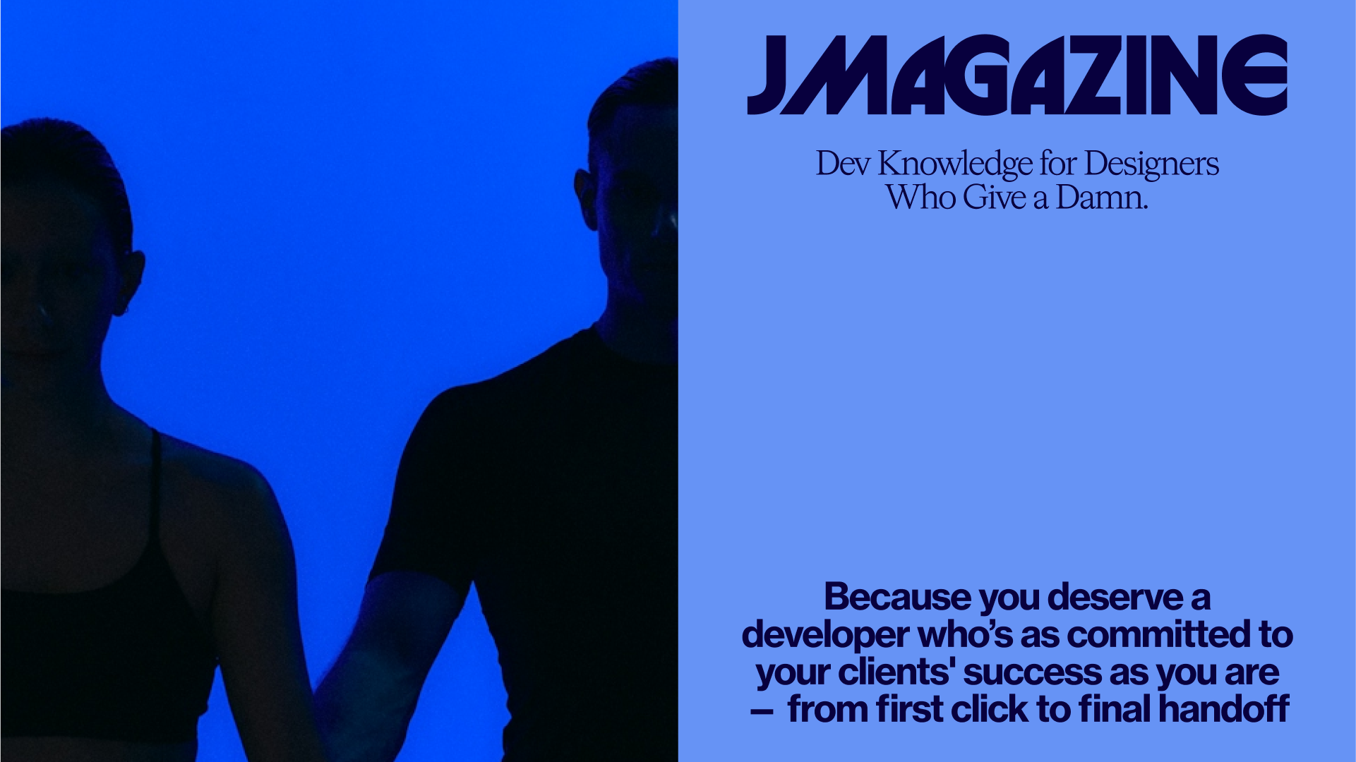
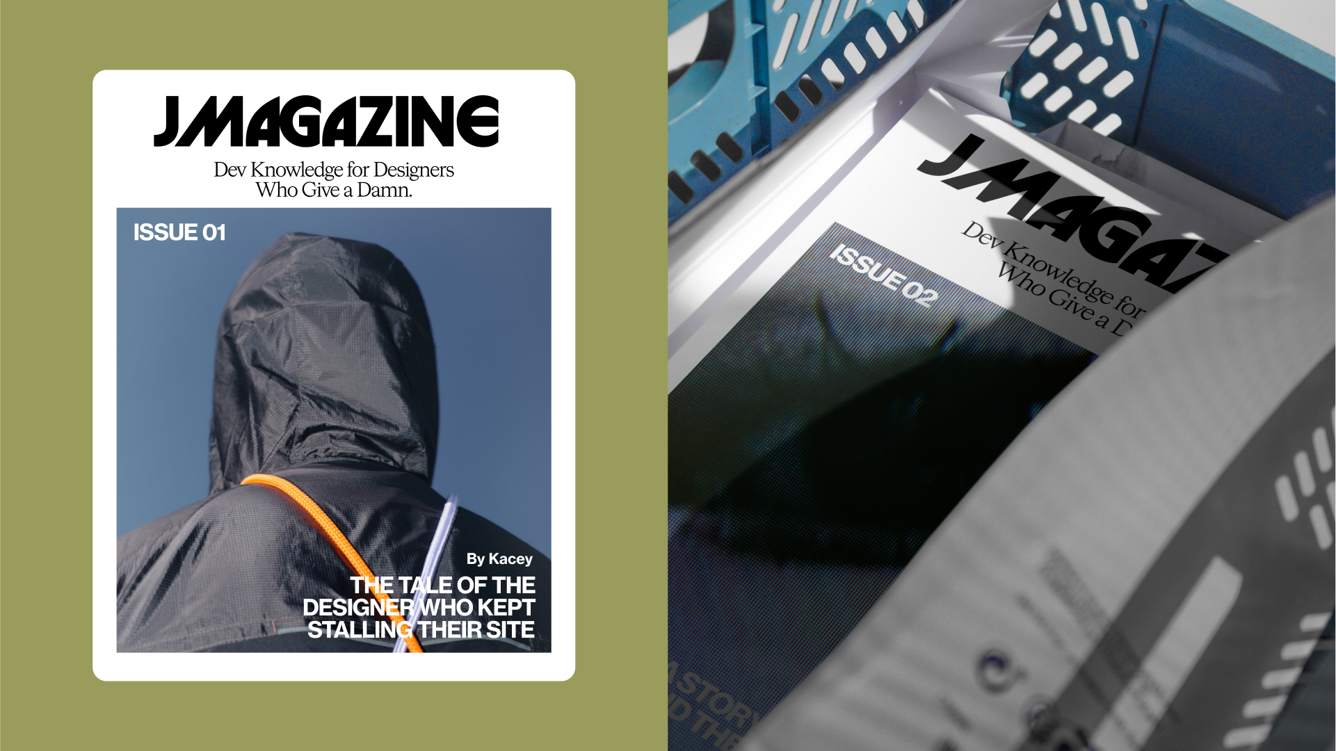
The System
The identity system is deliberately lean — built for modern founders and fast-moving teams. Jupiter shows up where it counts: clean web presence, modular case study architecture, flexible social assets, and a tone of voice that’s warm, witty, and to-the-point.
The Outcome
Jupiter now stands as a brand that designers want to work with and clients trust to execute. A studio that doesn’t shout. It supports. Because great development isn’t about ego — it’s about making great design sing.